Logo is the representation of any organization. Some logos are so famous that whenever we see them, we instantly remembers the name of an organization. Today we will see some most famous creative logos which defines the new level of creativity.
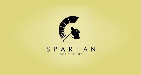
1. Spartan Golf Club
 Ref
Ref
This one is literally amazing. You can see a golfer and a Spartan head. Creativity at its best. Kudos to the creator!
2. Le de Tour France
You find anything different in it. Have a look again. Still NO. Let me tell you, here you can see a stick figure riding a bike in the letter ‘R’.
3. Yoga Australia
Do you find anything special in it ? See it again, you will find Australia’s map in the gap created between the hand and the leg. Isn't its creativity at its best ? ![]()
4. Flight Finder
See the creativity, an airplane in between the two F’s which also denotes the first letter of the two words ‘Flight Finder’.
5. Coffee Night
Again an amazing creativity. You can see a crescent moon in in the coffee mug, Moon to represent Night as in the company’s name. So damn creative!
6. Lion Bird
You can see a Lion’s face and also a bird. *wondering what I am doing with my life*. ![]()
7. Black Cat
This one is pretty easy to spot. You can see a cat’s eye, very clever use of ‘C’s.
8. Code Fish
A fish formed out of symbols. *can’t wait to try it so types it in here right away*
<*)))>{ Yep, it works. Good one!
9. Shift
The ‘H’ and the arrows blending in perfectly!
10. Magic coffee
What so different in it, see it again. You will find a cup of coffee or a magician’s hat?
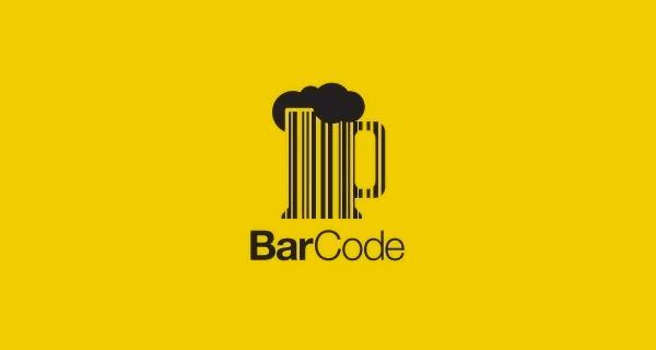
11. Bar Code
A bar code in the shape of a beer glass with beer in it. Beer-tastic one!
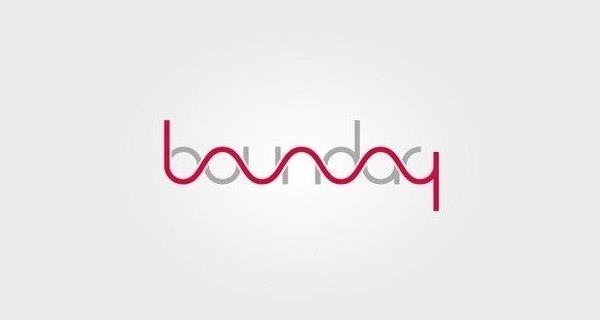
12. Boundary
This is one is way too smart!
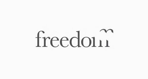
13. Freedom
The letter ‘M’ cut perfectly, showing a bird flying away representing the word freedom. How, like how do they manage to pull things off like this ? ![]()
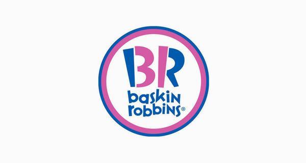
14. Baskin Robins
Look closer at the pink colored part of ‘B’ and ‘R’. They make ‘31’, which is the number of flavors they offer!
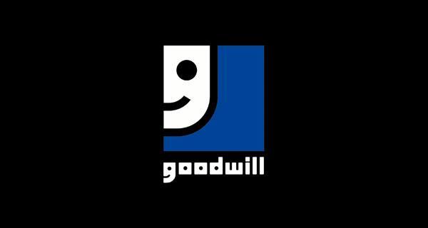
15. Goodwill
It looks like a ‘G’ in a corner but is actually a cartoon face smiling; or the other way around. Clever one, mate!
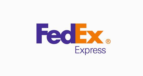
16. FedEx
A hidden arrow between ‘E’ and ‘X’. The arrow denotes how the company grows positively.
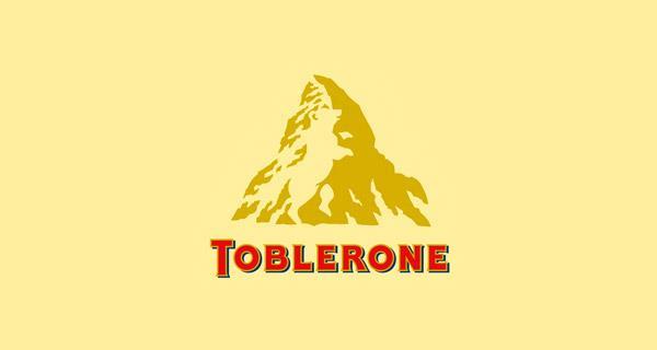
17. Toblerone
Do you see the hidden bear in the logo? I’ve had this chocolate for almost 17 years now and I’ve never noticed it till I read about it online. *shrugs*
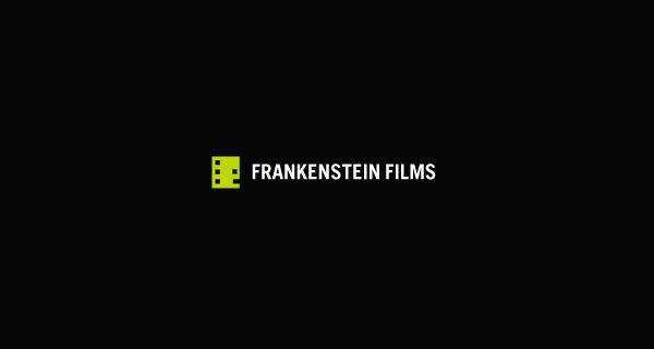
18. Frankenstein Films
Is that a movie reel or Frank’s head? A frank one, indeed!
19. ED’s Electric
It’s a socket and a pin with ‘E’ in between them!
Mindblowing indeed!
These minimalistic logos are so cool and creative! Let us know about your favorite ones in the comments below!


